Per-risk loss exposure
The FAIR report prices your whole risk portfolio at once, as a simulated distribution. Per-risk loss exposure does something different: it stores an annual loss exposure (ALE) figure on each individual risk, so you can rank a single finding by the money it represents and break the total down in the ways that matter to you.
Both figures describe the same portfolio. They are produced by different methods, and this page explains what each one is good for — including the cases where they will not match, which is expected rather than a fault.
Where the numbers come from
Mesh prices a risk using researched loss figures for that kind of risk — what an incident of that type typically costs an organization like yours. Axiad researches and maintains those figures centrally, and keeps them current, so you do not configure or calibrate anything.
Two things follow, and both are deliberate:
- If a kind of risk has not been researched yet, Mesh leaves it unpriced rather than guessing at a figure. See what the total does and does not include.
- Your figures are comparable with each other over time, because they move when your risks move, not when someone re-tunes a setting.
Where the figures appear
Per-risk loss exposure surfaces in three places, and they do not behave the same way.
On the Reports page: Your exposure over time
ALE historical snapshots, on the FAIR risk analysis report, shows how your measured exposure has moved — an expected figure for each point, with a low and high band around it.
Choose the period with the Week, Month and Year buttons in the top right of the card. Month is the default.
| Period | What you get |
|---|---|
| Week | The last 7 days, one point per day |
| Month | The last 30 days, one point per week |
| Year | The last 12 months, one point per month |
Each period is summarized at the granularity that suits it, so the chart stays readable and you are looking at the unit you are actually thinking in — days within a week, weeks within a month, months within a year.
Each point is that period's closing figure, not a total of the days inside it. Loss exposure is an annual rate rather than an amount, so a week's seven daily readings describe the same year seven times over; adding them together would not mean anything. "Where did it close?" is the question these points answer.
All three periods are always selectable. You do not have to wait until you have a year of history before you can choose Year — you will simply see the history you have.
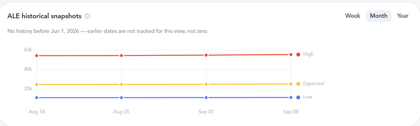
The chart begins on your first full day of measurement and is not backfilled, so soon after the feature is switched on you will see a short series. It tells you the date it starts from, just above the plot.
If the period you choose reaches back before that date, the chart says so rather than drawing a flat line at zero. No history is not the same as no exposure — one means Mesh was not measuring yet, the other means there was nothing to measure.
In an Agentic workspace: Six panels, composed on request
The same figures are available as panels in Generative UI.
The Executive View, Audit & Compliance, Security Operations and PQC Readiness workspaces compose the same panels they always have — none of the per-risk panels is among them, on any organization. You get one by asking for it.
To place one, open an Agentic workspace and type what you want into the chat, in your own words:
- "break our loss exposure down by identity type"
- "which risks are costing us the most?"
- "who carries the most loss exposure?"
- "show our total measured loss exposure"
Mesh composes the panel into the workspace and it stays there. Asking in the chat is the only way to add one — there is no widget menu or picker to browse, so there is nothing to go looking for.
The card is named after what you asked for, so the same panel can appear with different titles in different workspaces. The title is set when the panel is placed and stays as it is afterwards — so if you change what a panel is showing, its title does not follow. Rename it yourself if you want them to match.
| Panel | What it answers |
|---|---|
| ALE (measured) | What is our total measured exposure right now? |
| ALE by Identity Type | Is this a people problem, a machine-account problem, or an AI-agent problem? |
| ALE by Layer | Which kind of problem does the money sit in — basic hygiene, policy compliance, or behavior? |
| Top Risks by ALE | Which individual findings are worth the most to fix? |
| Top Identities by Loss Exposure | Which identities carry the most exposure? |
| ALE by Dimension | How does exposure split across a part of my organization I choose? |
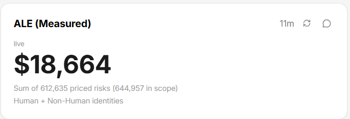
ALE (measured)
Your total, with the number of risks behind it. The figure never appears without saying how much of your portfolio it covers.
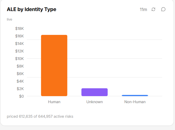
ALE by Identity Type
Splits the same total across the kinds of identity that carry it.
ALE by Layer
The same total again, split across the four layers described in Reading the layer breakdown.
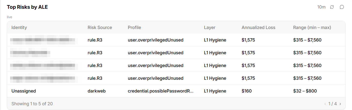
Top Risks by ALE
The individual findings worth the most, ranked, each with the identity it is against, what raised it, its layer, and its annual figure with a range. Identities are obscured in the screenshot below; in your own tenant they are the identities each risk is against.
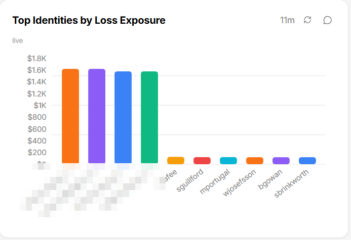
Top Identities by Loss Exposure
The identities carrying the most exposure, ranked, with a figure each. Human and non-human identities are ranked together, and exposure that comes from a non-human identity is counted against the identity that owns it — so someone can appear high on this list because of the service accounts in their name.
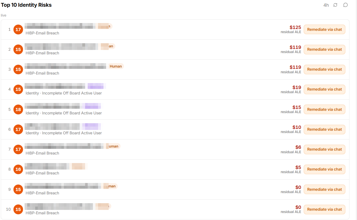
Your identities also carry their exposure into the lists you already use. In the
example below, each identity shows a residual figure beside its finding — and
the two $0 rows at the bottom are measured zeros. An identity with nothing
priced shows a dash instead.
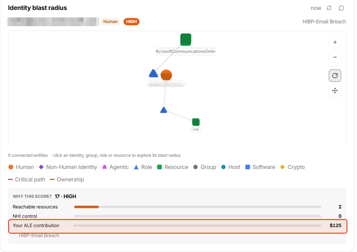
Selecting an identity: What one identity contributes
Selecting anyone in either list opens that identity, where Your ALE contribution sits alongside the rest of their blast radius — their own share of organizational exposure, beside the resources they can reach and the non-human identities they control.
This is what makes a ranked list useful: you go from who costs the most to and here is why, without leaving the workspace.
ALE by Dimension
A Break down by selector on the panel changes the split. The selector is built when the panel loads and offers only the dimensions that actually have attribution in your tenant, so the choices you see depend on what your connected sources supply — on most tenants that is one or two.
The panel names the share it cannot attribute rather than dropping it, and groups it under Unassigned. A large Unassigned share means the exposure is real but the attribution is missing, which is a data-source question, not a pricing one.
Measured, not simulated
This is the single most important distinction on this page.
| The FAIR report | Per-risk loss exposure | |
|---|---|---|
| What it does | Models your whole portfolio at once | Puts a figure on each risk, and adds them up |
| What you get | A likely range for the year ahead | One figure per risk, and a total |
| Best for | Framing and budgeting | Ranking, and deciding what to fix first |
| How fresh | As of the last report you generated | Live, as risks are raised and resolved |
Because these are two different ways of looking at the same portfolio, the two totals will not match, and neither is wrong when they differ. Use the report's range when you need to frame the year ahead; use the per-risk figures when you need to decide what to do next.
The two are easy to mix up by name. The panel called Annual loss exposure on the Executive View is the FAIR report's modelled figure; ALE (measured) is the per-risk total described here. If you put them side by side, expect different numbers.
Where a chart or panel can be fed by either method, Mesh labels it. On the ALE trend, a caption below the card marks any series drawn from simulated percentiles rather than the measured per-risk total.
What the total does and does not include
When a kind of risk has not been researched yet, Mesh leaves that risk unpriced rather than giving it a stand-in figure. A made-up number is indistinguishable from a real one once it reaches a board slide, and refusing to invent one is what makes the rest of these figures worth quoting.
Three things follow:
- An unpriced risk counts for nothing — not in the total, not in a chart, not in a ranking. It is absent from Top Risks by ALE rather than sorted to the bottom of it.
- Treat the total as a minimum. It can understate what you actually face. It will never overstate it by inventing a figure.
- Unpriced shows as no figure, never as
$0. If you see$0, that is a real measured zero, and it means something different.
If something you care about is never priced, tell Axiad Support and name it. Researching a new kind of risk is something Axiad does centrally, not something you configure.
Reading the layer breakdown
Every priced risk falls into one of four buckets, and the four always add up to the total.
| Layer | What it covers |
|---|---|
| L1 · Inventory hygiene | Accounts and inventory that are orphaned, dormant, or unowned. Anything not sorted elsewhere lands here. |
| L2 · Policy compliance | Risks raised by checking something against one of your policies or programs. |
| L3 · Behavioral correlation | Risks raised from behavior and from connections between accounts. |
| Uncategorized | Priced risks that have not been sorted into one of the three. |
Two things here surprise people, and both are working correctly:
- A layer can read
$0. It means you have no findings of that kind — not that the breakdown is broken. This is most common with L3, which depends on analysis not every organization has running yet. - Uncategorized is shown rather than hidden. Older risks recorded before layers existed have no layer of their own. Showing them keeps the bars adding up to your headline total; hiding them would quietly make the bars sum to less.
A large or growing Uncategorized share means risks are not being sorted, not that the money is wrong. The total is still right and the bars still add up to it — you simply get less detail about which kind of problem the money sits in. Contact Axiad Support if it grows.
Reading the identity-type breakdown
| Bucket | What it covers |
|---|---|
| Human | Risks on identities belonging to people. |
| Non-human | Risks on service accounts, workloads, and other machine identities. |
| AI agent | Risks on agentic identities. |
| Unknown | Priced risks whose identity could not be resolved. |
Unknown is a deliberate fourth bucket rather than being folded into non-human. Growth in Unknown means risks have stopped resolving to identities — a signal worth investigating, and one that folding it into another bucket would hide.
The range beside each figure
Each priced risk carries a low and a high figure alongside its main estimate.
Read it as a plausible span, not as a statistical confidence interval. It is deliberately wide — it pairs the most optimistic case against the most pessimistic one — and it widens further when ranges are added up across many risks. It is not comparable to the range on the FAIR report, which is built a different way and means something different.
How current the figures are
- The organization total and every breakdown are live. They reflect the risks currently open, and update as risks are raised and resolved.
- ALE historical snapshots can be up to a day behind. It is built from a nightly export, which is the correct granularity for a chart of daily points and the same latency the FAIR snapshots beside it have always had. It also only goes back as far as the day recording began for your organization.
- Everything settles overnight. Each risk is priced as it arrives, and a nightly pass re-checks the whole organization so the totals agree exactly.
While a lot of new data is arriving at once — onboarding, a new connector, an acquisition — your total can read high until that nightly pass settles it. A brand-new organization is handled differently: nothing is priced until the first complete pass, so your first figure is right rather than partial. Until then, risks show no figure at all rather than a provisional one.
When pricing is first enabled, your reported figures will move
The first time per-risk pricing is enabled for your organization, your reported exposure changes, and it may go down, possibly by a lot.
That is a correction, not a loss of data. Previously, a risk type with no researched entry could still receive a generic figure. Those risks are now either priced from their own researched entry or left unpriced — and for some risk types the researched figure is substantially lower than the generic one it replaces.
Axiad provides the expected change for your organization ahead of the switch. If a figure moves and you were not expecting it, contact your Axiad representative before drawing conclusions from the new number: the direction of the move on its own does not tell you which mechanism caused it.
Troubleshooting
| Symptom | Cause | Resolution |
|---|---|---|
| No ALE panels on your workspaces | Expected. They are never placed by default — ask for the breakdown you want. | No action. |
| Mesh answers that it cannot build an ALE panel, and the Reports page has no ALE historical snapshots chart | Per-risk pricing is not enabled for your organization. | Contact Axiad Support. |
| Mesh cannot build an ALE panel, but the ALE historical snapshots chart works | The panels are switched off separately from the figures themselves. | Contact Axiad Support if you need the panels. |
| The Break down by selector offers fewer dimensions than you expected | It only offers dimensions your connected sources actually attribute. | Connect or map the source that supplies the dimension you want. |
| A breakdown is dominated by Unassigned | The exposure is real, but the rows carry no value for that dimension. | The total is still correct. Fix the attribution at the source. |
| The total does not match the FAIR report | Expected — two different ways of measuring the same portfolio. | No action. Use the report to frame the year, these figures to decide what to fix. |
| A risk you care about is missing from Top Risks by ALE | That kind of risk has not been researched yet, so it is unpriced and absent from the ranking. | Tell Axiad Support which kind of risk it is. |
| The panel says pricing is still in progress | Some of your portfolio is priced and some is not yet, so the total covers only part of it. | Wait for the nightly pass. If it persists beyond a day, contact Axiad Support. |
A layer reads $0 while others are populated | You have no findings in that layer. | No action. This is a measured zero, not a fault. |
| Uncategorized is large or growing | Risks are not being sorted into a layer. | Contact Axiad Support. Your total is still correct and the bars still add up to it; you just get less detail. |
| Your total dropped sharply and you fixed nothing | Pricing was switched on, or the researched figures changed. | Contact your Axiad representative — they have the expected change for your organization. |
| ALE historical snapshots newest point looks a day old | The daily series comes from a nightly export. | Expected. The organization total on the panels is live. |
| ALE historical snapshots shows only a few points, or none | Recording began recently for your organization, and history is not backfilled. | Expected, and the card names the date it starts from. Try a shorter period. |
| One period shows far fewer points than another | Each period is summarized differently — daily, weekly, then monthly. | Expected. Use Week for day-by-day detail. |
| An identity's history restarts on the trend | The identity was merged with another, which re-anchors its history from that day. | Expected. The earlier series is not deleted; a new one begins beside it. |
Related
- Risk quantification — the FAIR methodology, the factor decomposition, and the Monte Carlo simulation.
- Reports, exports, and data retrieval — generating and consuming FAIR reports.
- Risk scoring — the 1–100 ranking that sits alongside the dollar figure.
- Quantify risk in dollars — the use case these figures serve.
- Generative UI — composing a workspace, and the panels you can ask for.
- Reports, exports, and data retrieval — the Reports page these snapshots sit on.