End-user onboarding
Welcome to Axiad Mesh! As a first-time user, this is what you can expect.
This is the onboarding experience for a Standard Mesh user (no administrative privileges in Axiad Mesh). If you're an admin user, see the Admin Guide instead.
You can sign in to Axiad Mesh by using the step-by-step guide below.
First-time sign-in
To kick off your Axiad journey, you'll have access to the Axiad Mesh environment set up by your admins. You'll receive an invite email from Axiad with a link that takes you directly to the web application.
-
From the Axiad welcome email, select the sign-in link, which opens a web browser.
-
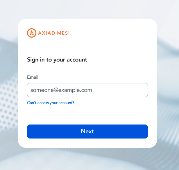
On the sign-in page, enter your email address and select Next.
-
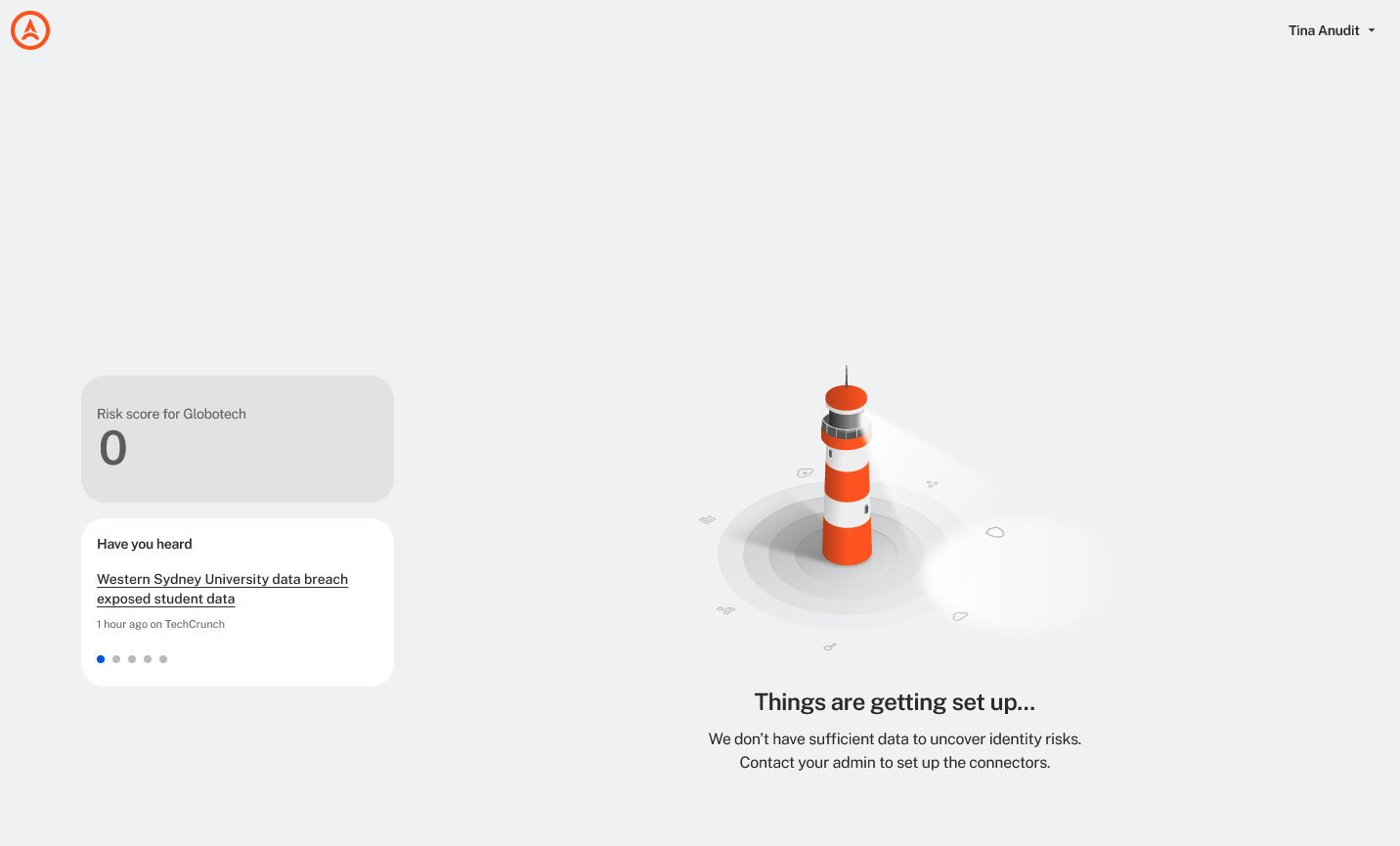
After you authenticate through your identity provider (IdP), you land on the Axiad Mesh homepage. Depending on how much your admins have completed, you could immediately see the bubble chart visualization, or you may see a Things are getting set up page.
 Subsequent sign-ins
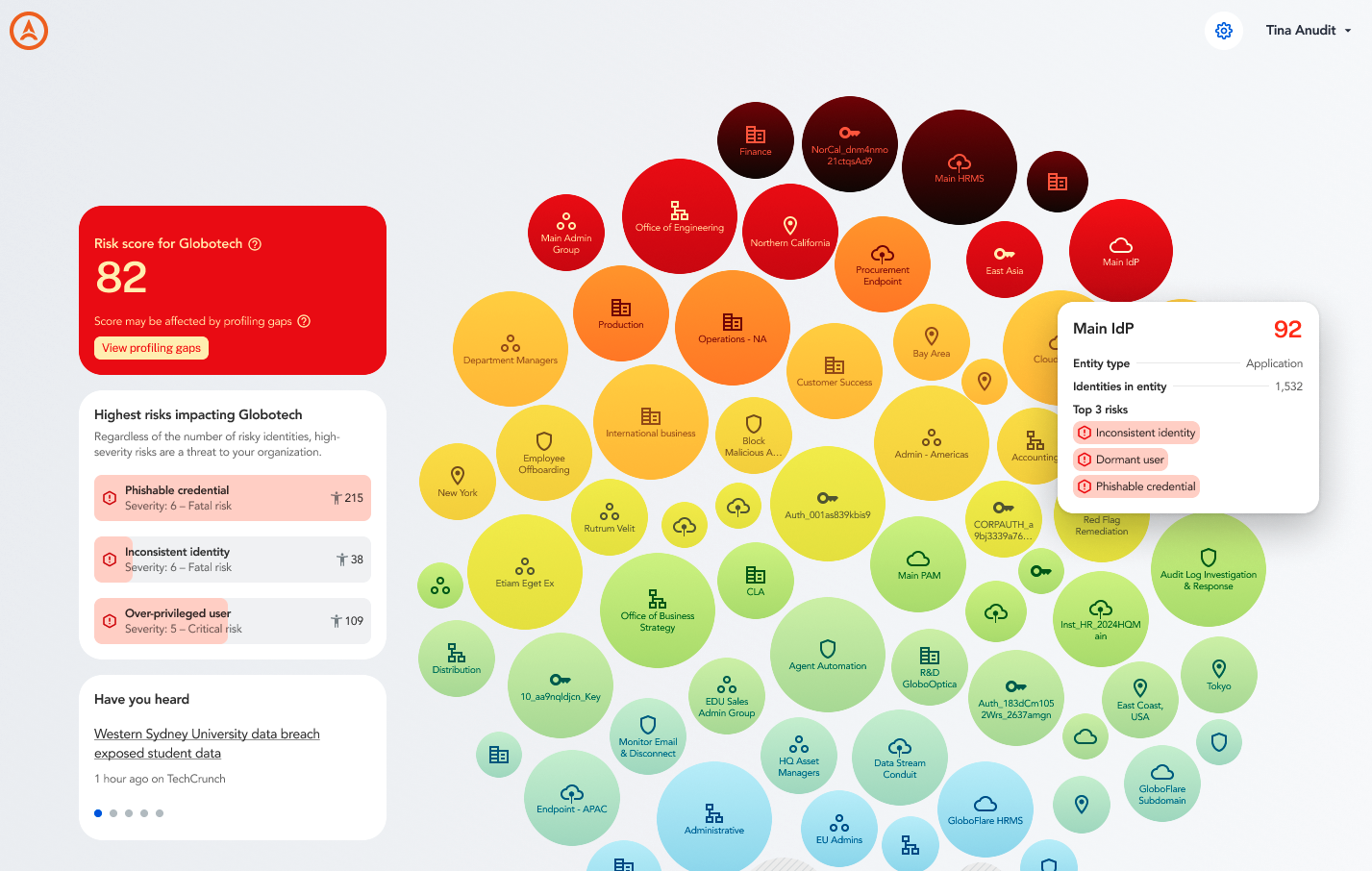
Once the connectors are integrated, the homepage displays your identity ecosystem visualization so you can instantly see the overview of your environment.
-
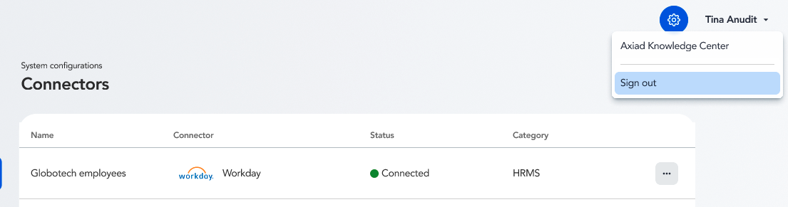
To sign out of Axiad Mesh, select your name in the top-right corner and select Sign out.
Welcome to Axiad Mesh
Once your Axiad Mesh dashboard is set up, you can quickly get the information you need, with options to dig deeper into each entity, identity, and potential risk.
Mesh widgets
On the left-hand side of the application, you can see the quick-reference widgets that give you an immediate snapshot of your environment and the world of cybersecurity.
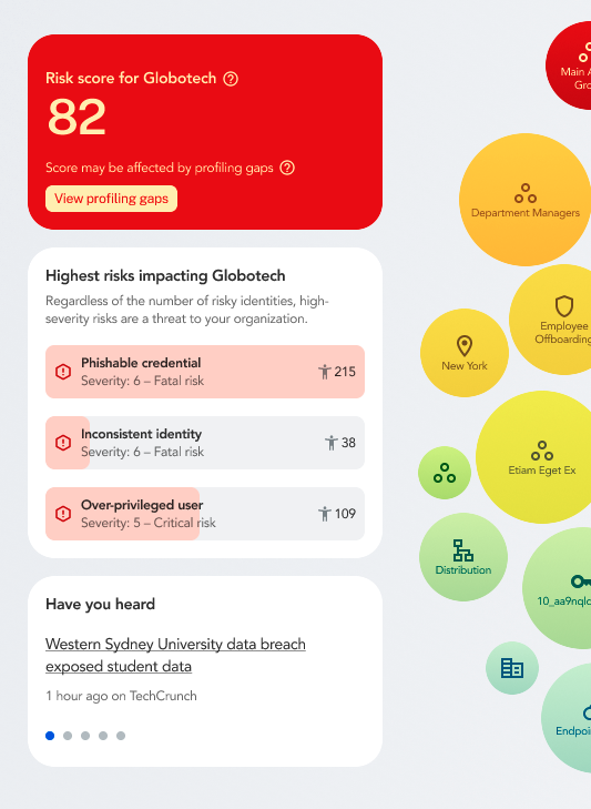
The first widget is your organization's overall risk score. Mesh generates it by compiling the individual risk scores from identities, applications, credentials, behavior, and other sources into a top-level rating. Scores range from 1 to 100, with 100 being the riskiest.
Here, you can also address profiling gaps (that is, unconfirmed account associations) to get a more accurate risk score for your organization.
The next widget details your organization's highest risks to help you understand why you have the score that you have. You can then use this information to improve your security posture and simultaneously lower your risk score.
The last widget includes an industry news feed to give you an immediate heads-up on the latest happenings in the cybersecurity world.
Bubble chart overview
The main bubble chart visualization is made up of entities, each with their own risk score and organized by level of riskiness, with the highest risk bubbling up at the top.
An entity could be an application, location, authentication method, department, or something else that spans your environment.
From here, you can hover over each bubble to get a preview of the assessment, or select an entity to get complete information about it, including risk score details, associated identities, potential blast radius, and more. You can also group entities together to see how they overlap and what risks are possible with those relationships.
Check out more articles within the User Guide to see how you can turn this high-level overview into remedial actions.